作者:鱼儿没有水会死_543 | 来源:互联网 | 2022-11-18 20:39
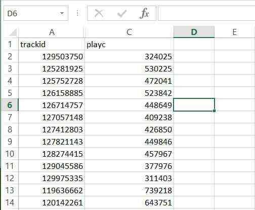
假设我有以下dataframe的R:
df1 <- read.csv("jan.csv", stringsAsFactors = FALSE, header = TRUE)
str(df1)

'data.frame':   4 obs. of  5 variables:
 $ JANUARY: chr  "D-150" "D-90" "D-60" "D-30"
 $ X2016  : num   0.24    0.5    0.63   0.76
 $ X2017  : num   0.32    0.45   0.6    0.79
 $ X2018  : num   0.2     0.4    0.61   0.82
 $ X2019  : num   0.21    0.35   0.63   0.85
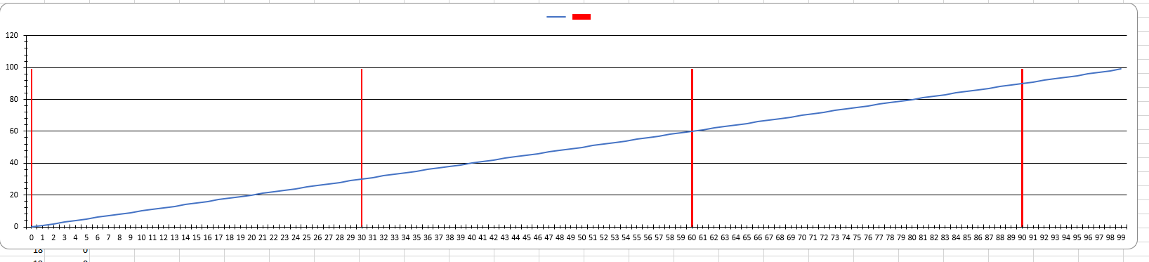
我如何使用ggplot2输出如下图所示的图形(制作Excel):

我很乐意制作一个简单的column chartin,ggplot2但我正在努力对如上所示的条形图进行分组并放置相关的标签.另外,我需要重塑数据才能实现这一目标吗?
1> Paweł Chabro..:
是的你可以.我认为你的年份标签不正确.检查我的情节:

这是生成图的代码:
library(tidyverse)

df1 %>%
  gather(year, value, X2016:X2019) %>%
  mutate(JANUARY = JANUARY %>% fct_rev() %>% fct_relevel('D-150')) %>%
  group_by(JANUARY) %>%
  mutate(y_pos = min(value) / 2) %>%
  ggplot(aes(
    x = JANUARY,
    y = value,
    fill = JANUARY,
    group = year
  )) +
  geom_col(
    position = position_dodge(.65),
    width = .5
  ) +
  geom_text(aes(
      y = value + max(value) * .03,
      label = round(value * 100) %>% str_c('%')
    ),
    position = position_dodge(.65)
  ) +
  geom_text(aes(
      y = y_pos,
      label = str_remove(year, 'X')
    ),
    color = 'white',
    angle = 90,
    fOntface= 'bold',
    position = position_dodge(.65)
  ) +
  scale_y_continuous(
    breaks = seq(0, .9, .1),
    labels = function(x) round(x * 100) %>% str_c('%')
  ) +
  scale_fill_manual(values = c(
    rgb(47, 85, 151, maxColorValue = 255),
    rgb(84, 130, 53, maxColorValue = 255),
    rgb(244, 177, 131, maxColorValue = 255),
    rgb(112, 48, 160, maxColorValue = 255)
  )) +
  theme(
    plot.title = element_text(hjust = .5),
    panel.background = element_blank(),
    panel.grid.major.y = element_line(color = rgb(.9, .9, .9)),
    axis.ticks = element_blank(),
    legend.position = 'none'
  ) +
  xlab('') +
  ylab('') +
  ggtitle('Month of JANUARY')


 京公网安备 11010802041100号