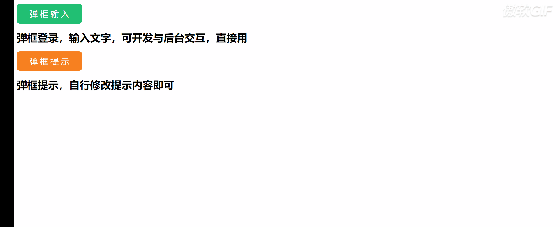
演示效果如下:

<html>
<head>
<meta charset="utf-8">
<title>按钮悬停动画title>

<style> html, body { color: white; background: #323232; font-weight: lighter; } h1, h2, h3, h4 { font-family: "Oswald"; } .wrapper { display: -webkit-box; display: -ms-flexbox; display: flex; -webkit-box-orient: vertical; -webkit-box-direction: normal; -ms-flex-direction: column; flex-direction: column; -ms-flex-wrap: wrap; flex-wrap: wrap; -webkit-box-align: center; -ms-flex-align: center; align-items: center; -webkit-box-pack: center; -ms-flex-pack: center; justify-content: center; width: 100vw; height: 100vh; } .wrapper .row { display: -webkit-box; display: -ms-flexbox; display: flex; margin: 10px 0; } .wrapper h2 { font-size: 1.8em; } .button { position: relative; cursor: pointer; color: white; font-family: "Lato"; font-size: 1.5em; padding: 0.5em 1em 0.65em; margin: 0 10px; } .button .inner { position: absolute; top: 0; left: 0; width: 100%; height: 100%; } .button:nth-of-type(1):before, .button:nth-of-type(1):after, .button:nth-of-type(1) .inner:before, .button:nth-of-type(1) .inner:after { background-color: #ffa726; } .button:nth-of-type(2):before, .button:nth-of-type(2):after, .button:nth-of-type(2) .inner:before, .button:nth-of-type(2) .inner:after { background-color: #26a69a; } .button:nth-of-type(3):before, .button:nth-of-type(3):after, .button:nth-of-type(3) .inner:before, .button:nth-of-type(3) .inner:after { background-color: #7e57c2; } .button:before, .button:after, .button .inner:before, .button .inner:after { position: absolute; content: ""; display: block; -webkit-transition: -webkit-transform 0.3s; transition: -webkit-transform 0.3s; transition: transform 0.3s; transition: transform 0.3s, -webkit-transform 0.3s; } .button.horizontal:before, .button.horizontal:after, .button.both:before, .button.both:after { left: 0; width: 100%; height: 2px; -webkit-transform: scaleX(0); transform: scaleX(0); } .button.horizontal .inner:before, .button.horizontal .inner:after, .button.both .inner:before, .button.both .inner:after { top: 0; width: 2px; height: 100%; -webkit-transform: scaleY(0); transform: scaleY(0); } .button.horizontal .inner:before, .button.both .inner:before { left: 0; } .button.horizontal .inner:after, .button.both .inner:after { right: 0; } .button.horizontal .inner:hover:before, .button.horizontal .inner:hover:after, .button.both .inner:hover:before, .button.both .inner:hover:after { -webkit-transform: scaleY(1); transform: scaleY(1); } .button.horizontal:before, .button.both:before { top: 0; } .button.horizontal:after, .button.both:after { bottom: 0; } .button.horizontal:hover:before, .button.horizontal:hover:after, .button.both:hover:before, .button.both:hover:after { -webkit-transform: scaleX(1); transform: scaleX(1); } .button.horizontal:hover .inner:before, .button.horizontal:hover .inner:after, .button.both:hover .inner:before, .button.both:hover .inner:after { -webkit-transform: scaleY(1); transform: scaleY(1); } .button.horizontal.clockwise .inner:before, .button.both.clockwise .inner:before { -webkit-transform-origin: top center; transform-origin: top center; } .button.horizontal.clockwise .inner:after, .button.both.clockwise .inner:after { -webkit-transform-origin: bottom center; transform-origin: bottom center; } .button.horizontal.clockwise:before, .button.both.clockwise:before { -webkit-transform-origin: right center; transform-origin: right center; } .button.horizontal.clockwise:after, .button.both.clockwise:after { -webkit-transform-origin: left center; transform-origin: left center; } .button.horizontal.clockwise:hover .inner:before, .button.both.clockwise:hover .inner:before { -webkit-transform-origin: bottom center; transform-origin: bottom center; } .button.horizontal.clockwise:hover .inner:after, .button.both.clockwise:hover .inner:after { -webkit-transform-origin: top center; transform-origin: top center; } .button.horizontal.clockwise:hover:before, .button.both.clockwise:hover:before { -webkit-transform-origin: left center; transform-origin: left center; } .button.horizontal.clockwise:hover:after, .button.both.clockwise:hover:after { -webkit-transform-origin: right center; transform-origin: right center; } .button.horizontal.counterclockwise .inner:before, .button.both.counterclockwise .inner:before { -webkit-transform-origin: bottom center; transform-origin: bottom center; } .button.horizontal.counterclockwise .inner:after, .button.both.counterclockwise .inner:after { -webkit-transform-origin: top center; transform-origin: top center; } .button.horizontal.counterclockwise:before, .button.both.counterclockwise:before { -webkit-transform-origin: left center; transform-origin: left center; } .button.horizontal.counterclockwise:after, .button.both.counterclockwise:after { -webkit-transform-origin: right center; transform-origin: right center; } .button.horizontal.counterclockwise:hover .inner:before, .button.both.counterclockwise:hover .inner:before { -webkit-transform-origin: top center; transform-origin: top center; } .button.horizontal.counterclockwise:hover .inner:after, .button.both.counterclockwise:hover .inner:after { -webkit-transform-origin: bottom center; transform-origin: bottom center; } .button.horizontal.counterclockwise:hover:before, .button.both.counterclockwise:hover:before { -webkit-transform-origin: right center; transform-origin: right center; } .button.horizontal.counterclockwise:hover:after, .button.both.counterclockwise:hover:after { -webkit-transform-origin: left center; transform-origin: left center; } .button.vertical:before, .button.vertical:after { top: 0; width: 2px; height: 100%; -webkit-transform: scaleY(0); transform: scaleY(0); } .button.vertical:before { left: 0; } .button.vertical:after { right: 0; } .button.vertical:hover:before, .button.vertical:hover:after { -webkit-transform: scaleY(1); transform: scaleY(1); } .button.vertical.clockwise:before { -webkit-transform-origin: top center; transform-origin: top center; } .button.vertical.clockwise:after { -webkit-transform-origin: bottom center; transform-origin: bottom center; } .button.vertical.clockwise:hover:before { -webkit-transform-origin: bottom center; transform-origin: bottom center; } .button.vertical.clockwise:hover:after { -webkit-transform-origin: top center; transform-origin: top center; } .button.vertical.counterclockwise:before { -webkit-transform-origin: bottom center; transform-origin: bottom center; } .button.vertical.counterclockwise:after { -webkit-transform-origin: top center; transform-origin: top center; } .button.vertical.counterclockwise:hover:before { -webkit-transform-origin: top center; transform-origin: top center; } .button.vertical.counterclockwise:hover:after { -webkit-transform-origin: bottom center; transform-origin: bottom center; } .codepen-link { position: absolute; bottom: 30px; right: 30px; height: 40px; width: 40px; z-index: 10; border-radius: 50%; box-sizing: border-box; background-image: url("https://s3-us-west-2.amazonaws.com/s.cdpn.io/544318/logo.jpg"); background-position: center center; background-size: cover; opacity: 0.5; -webkit-transition: all 0.25s; transition: all 0.25s; } .codepen-link:hover { opacity: 0.8; box-shadow: 0 0 6px #efefef; } style>
head>
<body>

<div class="wrapper">
  <h2>Clockwiseh2>
  <div class="row">
    <div class="button clockwise horizontal">Horizontaldiv>
    <div class="button clockwise vertical">Verticaldiv>
    <div class="button clockwise both">Both
      <div class="inner">div>
    div>
  div>
  <h2>Counter-clockwiseh2>
  <div class="row">
    <div class="button counterclockwise horizontal">Horizontaldiv>
    <div class="button counterclockwise vertical">Verticaldiv>
    <div class="button counterclockwise both">Both
      <div class="inner">div>
    div>
  div>
div>

body>
html>


 京公网安备 11010802041100号