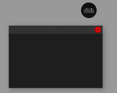
效果图
各位条子,大家上午好!
今天给大家带来的是 HTML5+CSS3音量调节旋转按钮源码!
大家可以按照自己意愿 修改成自己喜欢的样子!
有想要文件版源码的条子 可以私聊小编哦!
废话不多说,上源码!
@charset "utf-8";
body, ul, dl, dd, dt, ol, li, p, h1, h2, h3, h4, h5, h6, textarea,
form, select, fieldset, table, td, div, input
{margin:0;padding:0;-webkit-text-size-adjust: none}
h1, h2, h3, h4, h5, h6{font-size:12px;font-weight:normal}
body>div{margin:0 auto}
div {text-align:left}
a img {border:0}
body { color: #333; text-align: center; font: 12px "微软雅黑"; }
ul, ol, li {list-style-type:none;vertical-align:0}
a {outline-style:none;color:#535353;text-decoration:none}
a:hover { color: #D40000; text-decoration: none}
.clear{height:0; overflow:hidden; clear:both}
.button {display: inline-block;zoom: 1; *display:
inline;vertical-align: baseline;margin: 0 2px;outline: none;cursor:
pointer;text-align: center;text-decoration: none;font: 14px/100%
Arial, Helvetica, sans-serif;padding:0.25em 0.6em
0.3em;text-shadow: 0 1px 1px rgba(0,0,0,.3);-webkit-border-radius:
.5em; -moz-border-radius: .5em;border-radius:
.5em;-webkit-box-shadow: 0 1px 2px rgba(0,0,0,.2);-moz-box-shadow:
0 1px 2px rgba(0,0,0,.2);box-shadow: 0 1px 2px rgba(0,0,0,.2);
}
.red {color: #faddde;border: solid 1px #980c10;background:
#d81b21;background: -webkit-gradient(linear, left top, left bottom,
from(#ed1c24), to(#A51715));background: -moz-linear-gradient(top,
#ed1c24, #A51715);filter:
progid:DXImageTransform.Microsoft.gradient(startColorstr='#ed1c24',
endColorstr='#aa1317');
}
.red:hover { background: #b61318; background:
-webkit-gradient(linear, left top, left bottom, from(#c9151b),
to(#a11115)); background: -moz-linear-gradient(top, #c9151b,
#a11115); filter:
progid:DXImageTransform.Microsoft.gradient(startColorstr='#c9151b',
endColorstr='#a11115'); color:#fff;}
.red:active {color: #de898c;background: -webkit-gradient(linear,
left top, left bottom, from(#aa1317), to(#ed1c24));background:
-moz-linear-gradient(top, #aa1317, #ed1c24);filter:
progid:DXImageTransform.Microsoft.gradient(startColorstr='#aa1317',
endColorstr='#ed1c24');}
.cor_bs,.cor_bs:hover{color:#ffffff;}
.keBody{background:url(../images/bodyBg.jpg) repeat #333;}
.keTitle{height:100px; line-height:100px; font-size:30px;
font-family:'微软雅黑'; color:#FFF; text-align:center;
background:url(../images/bodyBg3.jpg) repeat-x bottom left;
font-weight:normal; overflow:hidden}
.kePublic{background:#FFF; padding:50px; height: 100%; background:
-webkit-radial-gradient(50% 0, circle, #3c3b4d 0%, #15131a 50%);
background: radial-gradient(circle at 50% 0, #3c3b4d 0%, #15131a
50%); text-align:center; color:#fff; font-size:18px;
line-height:32px;}
.keBottom{color:#FFF; padding-top:25px; line-height:28px;
text-align:center; font-family:'微软雅黑';
background:url(../images/bodyBg2.jpg) repeat-x top left;
padding-bottom:25px}
.keTxtP{font-size:16px; color:#ffffff;}
.keUrl{color:#FFF; font-size:30px;}
.keUrl:hover{ text-decoration: underline; color: #FFF; }
.mKeBanner,.mKeBanner div{text-align:center;}
.icon > * { position: absolute; bottom: 0; top: 0; left: 0;
right: 0; margin: auto; }
.icon { width: 14em; height: 14em; border-radius: 3em; position:
relative; -webkit-flex-shrink: 0; -ms-flex-negative: 0;
flex-shrink: 0; box-shadow: 0 0.5em 2em rgba(0, 0, 0, 0.3), inset 0
0.2em 0.4em -0.2em rgba(255, 255, 255, 0.2), 0 0 0.2em rgba(0, 0,
0, 0.4); background: -webkit-linear-gradient(top, #3F3F4C,
#191720); background: linear-gradient(to bottom, #3F3F4C, #191720);
margin:0 auto; margin-bottom:20px; }
.wheel { width: 6em; height: 6em; border-radius: 50%; box-shadow:
inset 0 0.1em 0.2em rgba(255, 255, 255, 0.2), 0 1em 2em 0.4em
rgba(0, 0, 0, 0.5), 0 -1em 2em 0.1em rgba(255, 255, 255, 0.1);
background: -webkit-linear-gradient(top, #525161, #322E3D);
background: linear-gradient(to bottom, #525161, #322E3D); }
.wheel .indicator { width: 100%; height: 100%; }
.wheel .indicator:after { content: ''; display: block; position:
absolute; background: #3B3A46; border-radius: 50%; width: .65em;
height: .65em; top: .6em; left: 0; right: 0; margin: auto;
box-shadow: 0 1px 1px -1px rgba(255, 255, 255, 0.4), inset 0 1px
1px rgba(0, 0, 0, 0.4); }
.outline { width: 12.5em; height: 12.5em; -webkit-transform:
translateZ(0) rotateZ(90deg); transform: translateZ(0)
rotateZ(90deg); }
.path { stroke-dasharray: 620; stroke-dashoffset: 620; }
@-webkit-keyframes path { 40% {
stroke-dashoffset: 100;
}
100% {
stroke-dashoffset: 620;
}
}
@keyframes path { 40% {
stroke-dashoffset: 100;
}
100% {
stroke-dashoffset: 620;
}
}
@-webkit-keyframes rotate { 40% {
-webkit-transform: rotateZ(320deg);
transform: rotateZ(320deg);
}
100% {
-webkit-transform: rotateZ(0);
transform: rotateZ(0);
}
}
@keyframes rotate { 40% {
-webkit-transform: rotateZ(320deg);
transform: rotateZ(320deg);
}
100% {
-webkit-transform: rotateZ(0);
transform: rotateZ(0);
}
}
.path { -webkit-animation: path 2s; animation: path 2s; }
.indicator { -webkit-animation: rotate 2s; animation: rotate 2s;
}


 京公网安备 11010802041100号