作者:爱走了我来了two_537 | 来源:互联网 | 2023-06-06 20:56
这篇文章主要介绍了Ant Design 组件库按钮实现示例详解,有需要的朋友可以借鉴参考下,希望能够有所帮助,祝大家多多进步,早日升职加薪<P><P><BR>
目录
- 1 antd 之 Button API
- 2 antd 之 Button 示例
1 antd 之 Button API
antd 组件库是基于 Ant Design 设计体系的 React UI 组件库,antd 为 Web 应用提供了丰富的基础 UI 组件,可以用于研发企业级中后台产品。这篇咱们介绍 antd 组件库之 按钮。
按钮 Button 是一个比较基础的 UI 组件,一般在有交互的应用中都会用到。
其 DOM 节点为
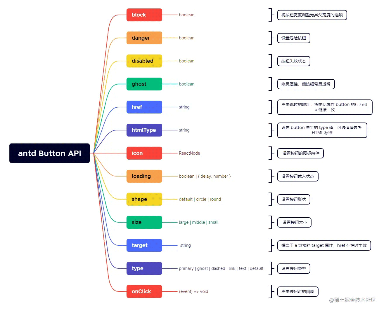
这些可配置的属性主要包括:type、shape、size、loading 等,详细的这里我进行一个整理:
下面做一些实践。
2 antd 之 Button 示例
先来看 type 属性的六个简单的按钮,上代码 (Javascript的):
import { Button } from 'antd';
import React from 'react';
const App = () => (
<>
);
export default App;
来看效果:

接下来看一波带 icon 图标的按钮,上代码:
import { SearchOutlined, PlayCircleOutlined,
ZoomInOutlined, RedoOutlined, AndroidOutlined,
AppleOutlined, WechatOutlined, EyeOutlined,
ShareAltOutlined, MessageOutlined} from '@ant-design/icons';
import { Button, Tooltip } from 'antd';
import React from 'react';
const App = () => (
<>
} />
}>
Search
} />
}>Search
} />
}>Search
} />
}>
Search
} href="https://www.google.com" rel="external nofollow" rel="external nofollow" />
} size="large" />
} size="large">
Search
} size="large" />
} size="large">
Search
} size="large" />
} size="large">
Search
} size="large" />
} size="large">
Search
} size="large" href="https://www.google.com" rel="external nofollow" rel="external nofollow" />
);
export default App;
来看效果:

你应该可以发现,我这里用了很多不同的 icon 图标,可以这么说:用 antd 的 Button 搭配 antd 的 Icon 图标,几乎能实现你想要的所有按钮样式。除了按钮的图标,上面的示例也演示了 按钮 Size 的调整,通过 size 可以配置 large 和 small, 分别对应将按钮设置为 大尺寸和 小尺寸,若不设置 size, 则默认为中尺寸。
接着,我们来看按钮的 disabled 属性,意思即为按钮处于不可用的状态,上代码:
import { Button } from 'antd';
import React from 'react';
const App = () => (
<>
);
export default App;
来看效果:

还有一种按钮是,点击后服务器需要响应一会儿,即加载状态,这个 Loding... 的状态用 antd 的按钮也可以展现,上代码:
import { PoweroffOutlined } from '@ant-design/icons';
import { Button, Space } from 'antd';
import React, { useState } from 'react';
const App = () => {
const [loadings, setLoadings] = useState([]);
const enterLoading = (index) => {
setLoadings((prevLoadings) => {
const newLoadings = [...prevLoadings];
newLoadings[index] = true;
return newLoadings;
});
setTimeout(() => {
setLoadings((prevLoadings) => {
const newLoadings = [...prevLoadings];
newLoadings[index] = false;
return newLoadings;
});
}, 6000);
};
return (
<>
} loading />
}
loading={loadings[1]}
OnClick={() => enterLoading(1)}
>
Click me!
}
loading={loadings[2]}
OnClick={() => enterLoading(2)}
/>
);
};
export default App;
来看效果:

好了,以上分享了 Ant Design 组件库之按钮。希望我的分享能对你的学习有一点帮助。
更多关于Ant Design 组件库按钮的资料请关注其它相关文章!


 京公网安备 11010802041100号