前言
微信小程序自带的消息提示框有字数限制,而且图标仅仅只有"success","loading","none"。当我们在实际开发过程中,面对UI给的设计图稿和微信小程序默认提供的消息提示框具有很大差别的时候,自然就不能再使用微信小程序的消息提示框,而应当使用component自定义消息提示框组件。
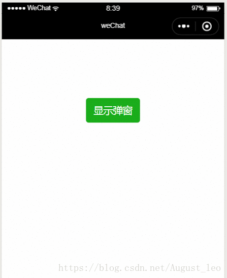
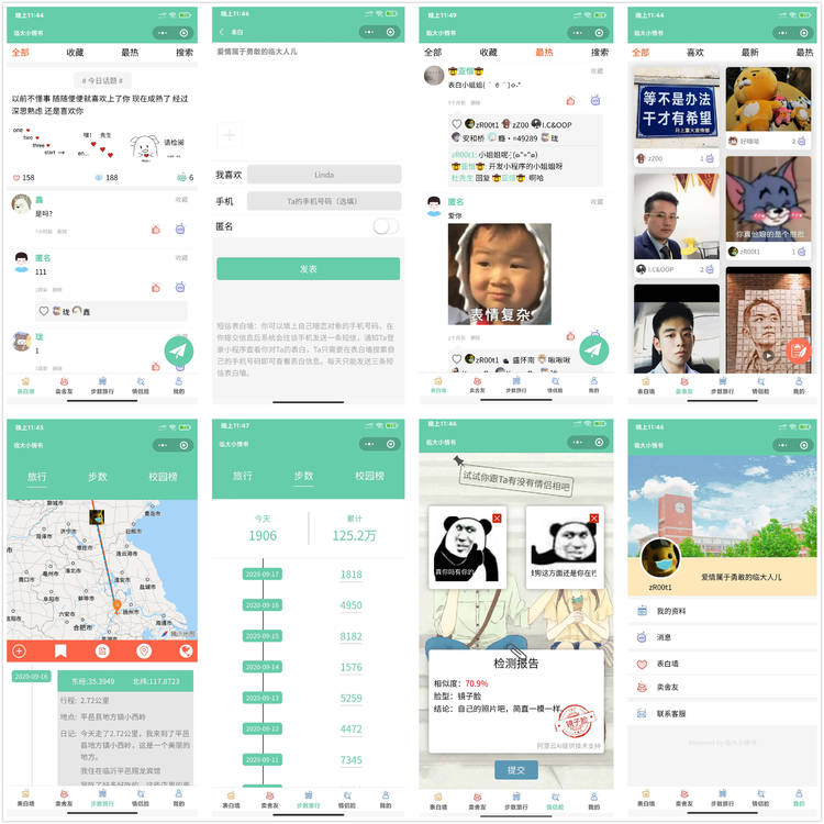
效果图
Step1:初始化组件
新建一个components文件夹,这个文件夹用来存放我们以后要开发的所有自定义组件。
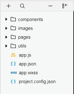
然后在components文件夹中创建Toast文件夹,在Toast上右击新建Component 之后就会自动创建相对应的wxml、wxss、js、json文件。

Step2:组件的相关配置
将toast.json 中component 设置为true
toast.json:
{
 "component": true,  // 自定义组件声明
 "usingComponents": {}  // 可选项,用于引用别的组件
}
然后在toast.wxml文件里写弹窗组件的模板,在toast.wxss文件里写组件的样式
toast.wxml:
{{information}}
toast.wxss:
/* components/Toast/toast.wxss */
.mask{
 width: 400rpx;
 height: 300rpx;
 border-radius:10rpx;
 position: fixed;
 z-index: 1000;
 top: 300rpx;
 left: 175rpx;
 background: rgba(0, 0, 0, 0.6);
}
.image{
 z-index: 1000;
 width: 120rpx;
 height: 120rpx;
 margin-left: 140rpx;
}
.info{
 margin-top:50rpx;
 z-index: 1000;
 text-align: center;
 color: #ffffff;
}
 width: 400rpx;
 height: 300rpx;
 border-radius:10rpx;
 position: fixed;
 z-index: 1000;
 top: 300rpx;
 left: 175rpx;
 background: rgba(0, 0, 0, 0.6);
}
.image{
 z-index: 1000;
 width: 120rpx;
 height: 120rpx;
 margin-left:80rpx;
}
.info{
 margin-top:50rpx;
 z-index: 1000;
 text-align: center;
 color: #ffffff;
}
Step3:定义属性、数据和事件
可以看到在toast.wxml文件中出现了{{isShow}}、{{icon}}、{{information}} 变量,这是为了组件模板能够根据传入的属性动态变化。
toast.js :
// components/Toast/toast.js
Component({
 /**
 * 组件的属性列表
 */
 properties: {    //定义组件属性
 information:{   //用来显示提示信息
  type: String,   // 类型(必填),目前接受的类型包括:String, Number, Boolean, Object, Array, null(表示任意类型)
  value: '提示信息'  // 属性初始值(可选),如果未指定则会根据类型选择一个
 },
 icon:{     //图标类型,我在images文件夹中存放了success和fail的两个图标
  type:String,
  value:'success'
 },
 showTime:{    //弹窗开始显示的时间单位ms
  type: Number,
  value:1000
 },
 hideTime: {    //弹窗开始隐藏的时间单位ms
  type: Number,
  value: 1000
 }
 },
 /**
 * 组件的初始数据
 */
 data: {
 isShow:true
 },
 /**
 * 组件的方法列表
 */
 methods:{
 showToast:function () {
  let that = this;
  setTimeout(function () {
  that.setData({
   isShow: !that.data.isShow
  });
  }, that.data.showTime);
 },
 hideToast: function (e) {
  let that = this;
  setTimeout(function(){
  that.setData({
   isShow: !that.data.isShow
  });
  },that.data.hideTime);
 }
 }
})
Step4:使用弹窗/strong>
目前已经完成了toast组件模板,接下来就是在需要显示这个弹窗的页面中使用它。
index.json:引入组件
{
 "usingComponents": {
 "toast": "/components/Toast/toast"
 }
}
index.wxml:
index.js:
// page/index/index.js
Page({
 /**
 * 页面的初始数据
 */
 data: {

 },
 show:function(){
 this.toast.showToast();
 this.toast.hideToast();
 },
 /**
 * 生命周期函数--监听页面加载
 */
 onLoad: function (options) {

 },
 /**
 * 生命周期函数--监听页面初次渲染完成
 */
 onReady: function () {
 this.toast = this.selectComponent("#toast");
 },
 /**
 * 生命周期函数--监听页面显示
 */
 onShow: function () {

 },
 /**
 * 生命周期函数--监听页面隐藏
 */
 onHide: function () {

 },
 /**
 * 生命周期函数--监听页面卸载
 */
 onUnload: function () {

 },
 /**
 * 页面相关事件处理函数--监听用户下拉动作
 */
 onPullDownRefresh: function () {

 },
 /**
 * 页面上拉触底事件的处理函数
 */
 onReachBottom: function () {

 },
 /**
 * 用户点击右上角分享
 */
 onShareAppMessage: function () {

 }
})
至此我们就完成了自定义toast组件的步骤。
以上就是本文的全部内容,希望对大家的学习有所帮助,也希望大家多多支持。


 京公网安备 11010802041100号 | 京ICP备19059560号-4 | PHP1.CN 第一PHP社区 版权所有