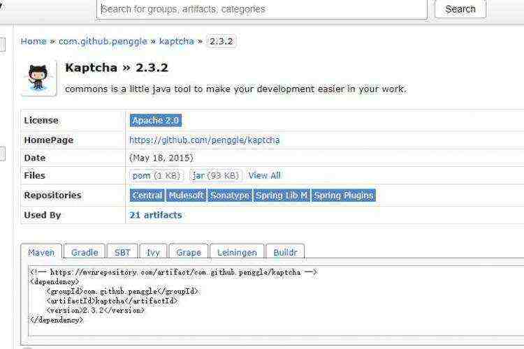
存在一个问题就是当屏幕缩小至一定宽度的时候,边框栏会被挤开

1 body {
 2   font-family: ‘Amarante‘, cursive;
 3   background: url(http://www.w3cplus.com/sites/default/files/bg_body.png) repeat;
 5 }
 6
 7 .wrapper {
 8   margin: 0 auto;
 9 }
11 .header-wrapper{
12   background-color: #BD9C8C;
13 }
15 .header {
16   width: 80%;
17   background-color: #BD9C8C;
18   margin: 0 auto;
19   margin-bottom: 5px;
20   text-align: center;
21
22 }
23
24
25 .main-content-wrapper{
26   width: 80%;
27   margin: 0 auto;
28 }
29 .main-content {
30     float: left;
31     border-left: 255px solid pink;
32     margin-bottom: 15px;
33     box-shadow: 0 1px 2px 1px rgba(0, 0, 0, 0.2);
34 }
38 .sidebar {
39   width: 250px;
40   float: left;
41   margin-bottom: 5px;
42   background-color: yellow;
43   margin-left: -80%;
44   margin-bottom: 15px;
45 }
46
51 .footer-wrapper{
52   clear: both;
53   background-color: #BD9C8C;
54 }
55 .footer {
56   clear: both;
57   width: 80%;
58   margin: 0 auto;
59   margin-bottom: 5px;
60   text-align: center;
61
62 }
DOCTYPE html>
<html lang="en">
<head>
    <meta charest="utf-8" />
     <title>testtitle>
<link rel="stylesheet" type="text/css" href="css/test1.css">
head>
    <body>
        <header class="header-wrapper">
            <div class="header">
                <h1>Header contenth1>
            div>
        header>

           <main class="container">
           <div class="main-content-wrapper">
            <section class="main-content">
                <h2>定义预格式化的文本,被包围在 pre 元素中的文本通常会保留空格和换行符。而文本也会呈现为等宽字体,可以导致段落断开的标签(例如标题、 和  标签)绝不能包含在所定义的块里,pre 元素中允许的文本可以包括物理样式和基于内容的样式变化,还有链接、图像和水平分隔线
                <br><br><br><br><br><br><br><br><br><br><br><br><br>h2>
            section>
        div>
            <aside class="sidebar">
                <h2>Sidebar Contenth2>
            aside>
        main>


        <footer class="footer-wrapper">
            <div class="footer">
                <h2>Footer Contenth2>
            div>
        footer>


    body>

html>


 京公网安备 11010802041100号